AccountView's Design System
Design systems are always undergoing evolution. Both from the internal pressures and needs of the products it supports, and the very active community of thought leaders and companies that are pushing what it can do. It's the most exciting and impactful part of product design at the moment, a shining example of what true collaboration between design and development can accomplish.
Here are the latest enhancements I've made to the AccountView design system, which I primarily planned and built, with great help from my colleague, design engineer Kristina McCool.
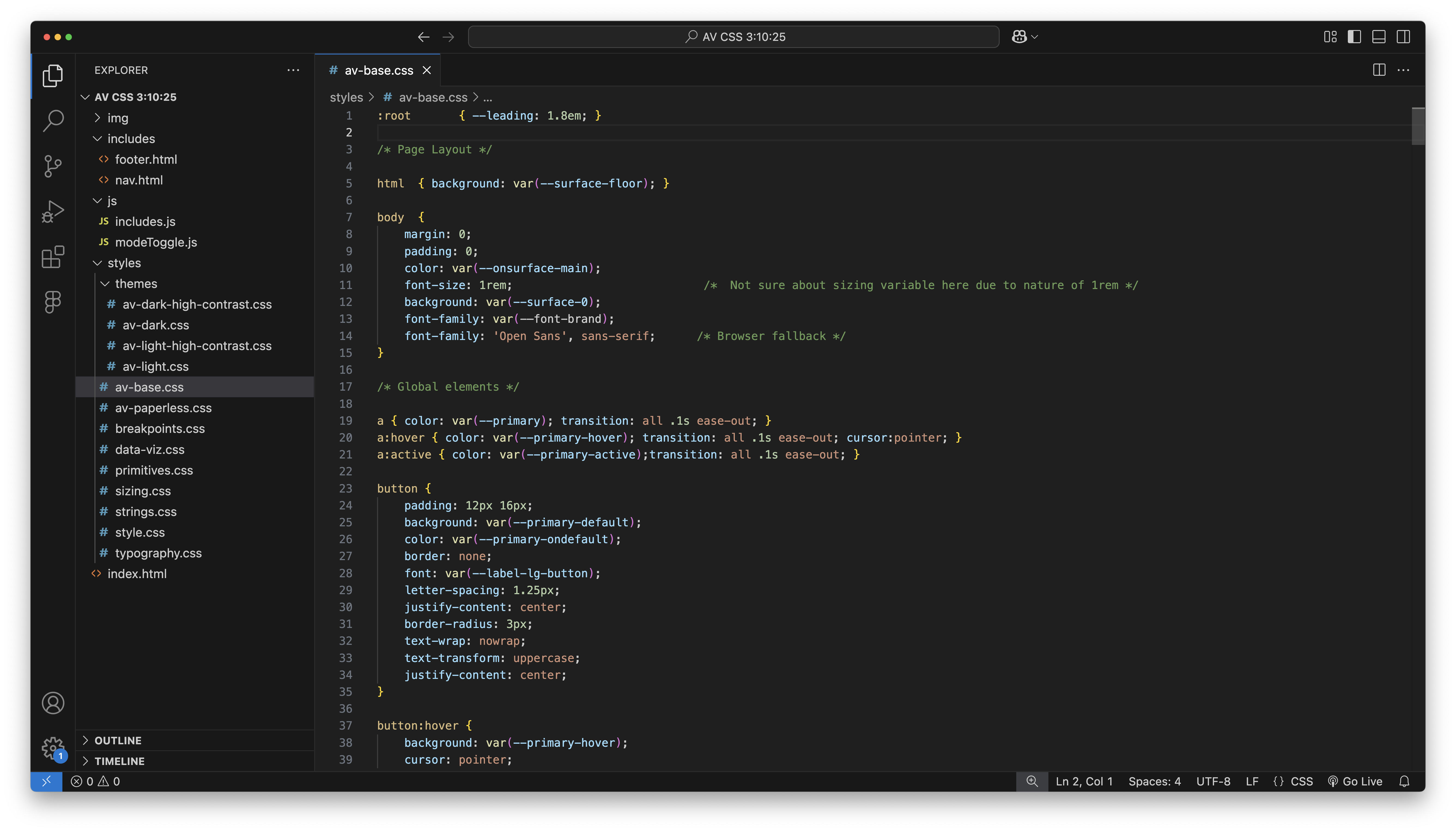
It's hard to understate the impact of modern design system that is properly implemented and consumable. Every style variable, every component, every template represents a moment where designs and code didn't have to be created/reviewed/tested from scratch. I estimate the team gained at least a 5x increase in velocity and smoother deliveries. Designers effecively get to clear their minds of many basic, tedious decisions, allwoing them to create with much more conviction.
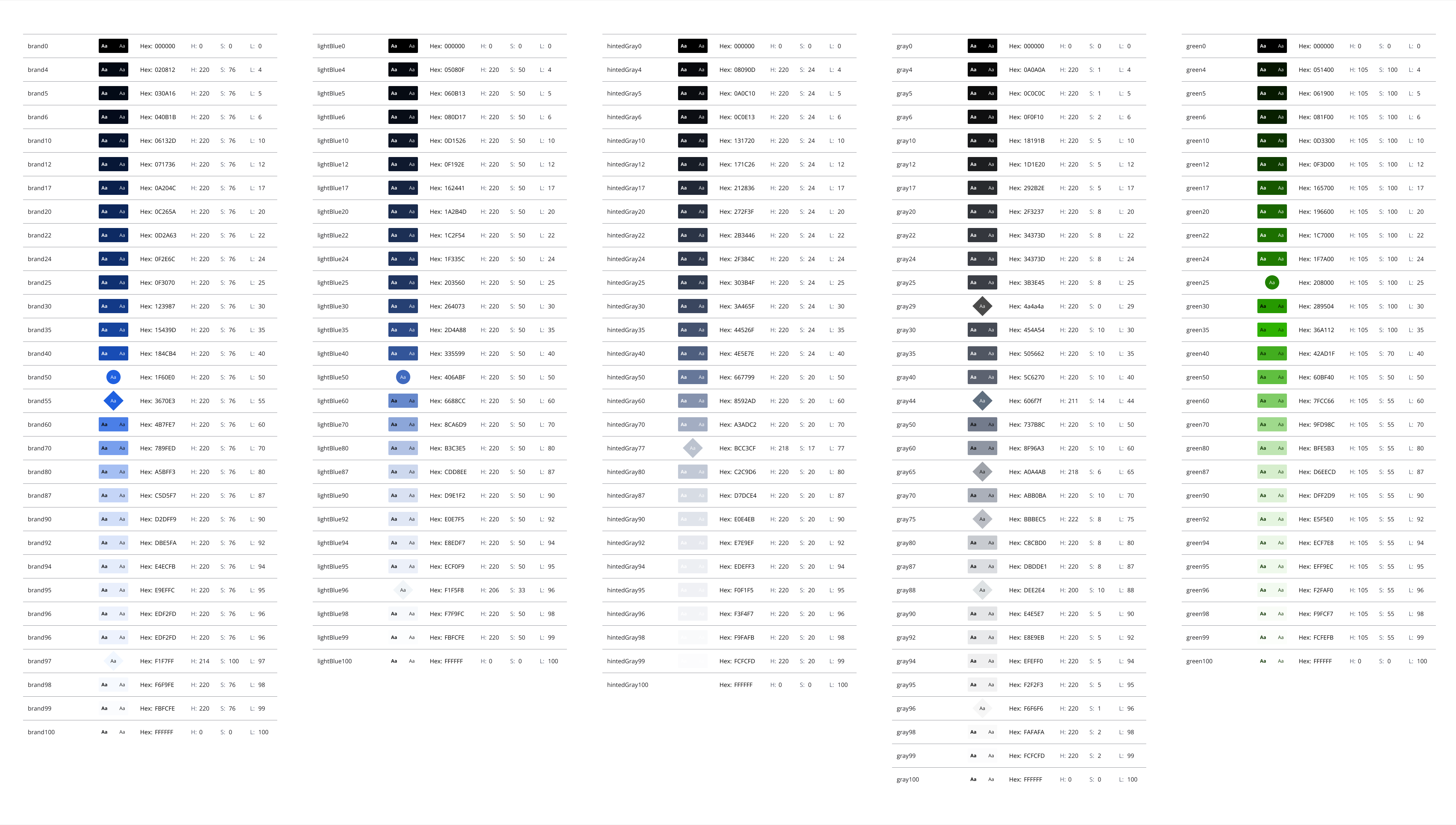
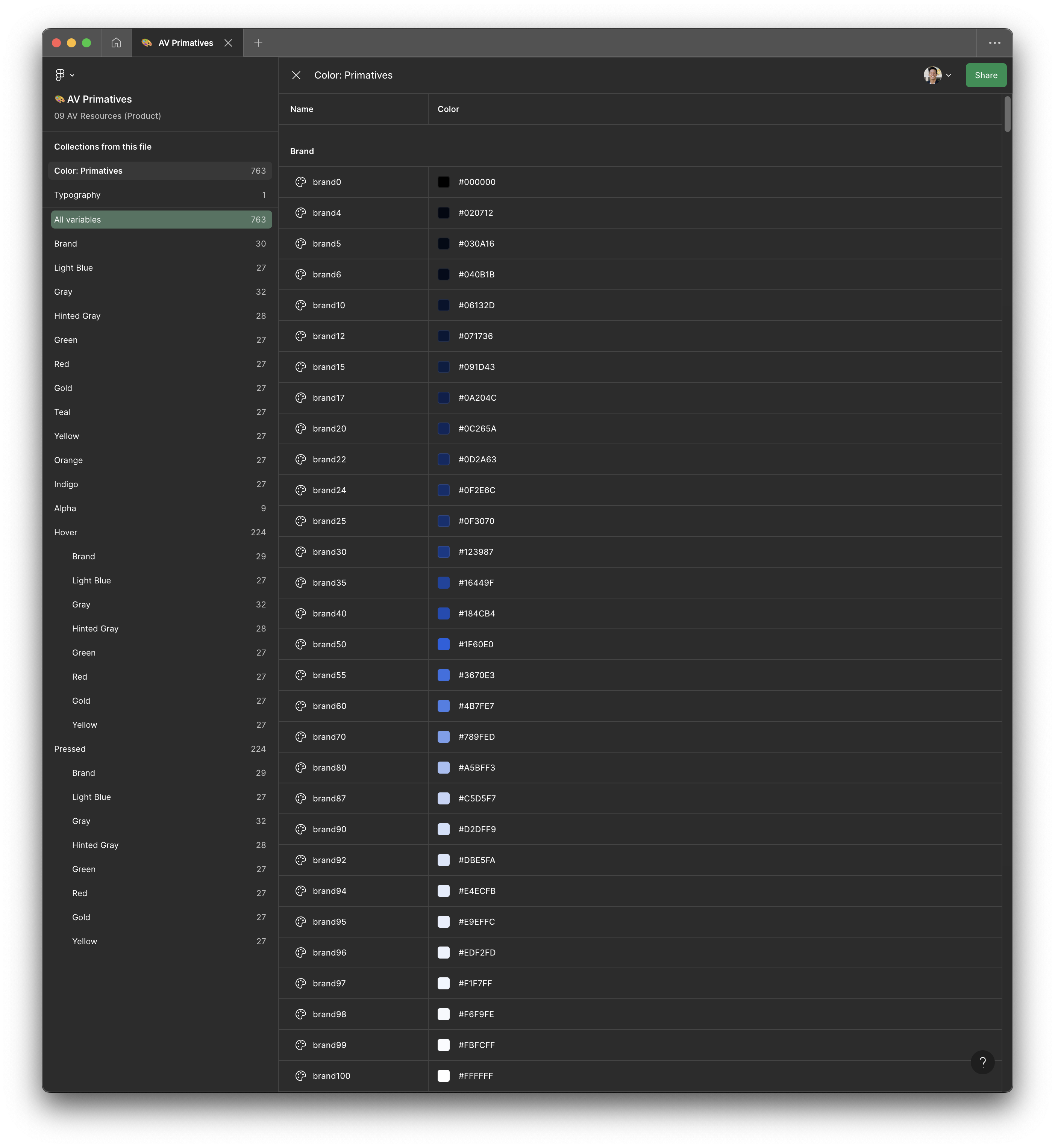
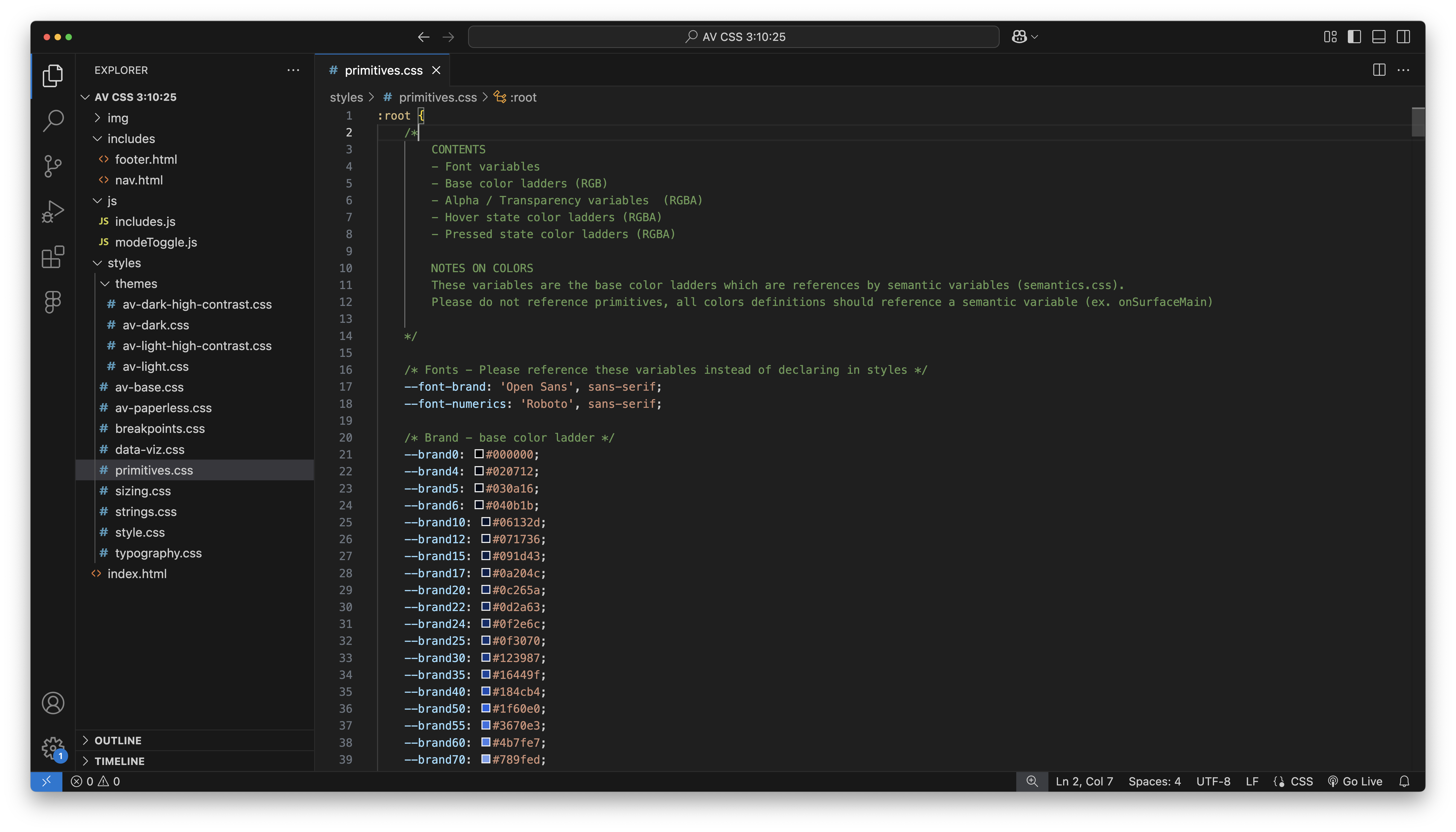
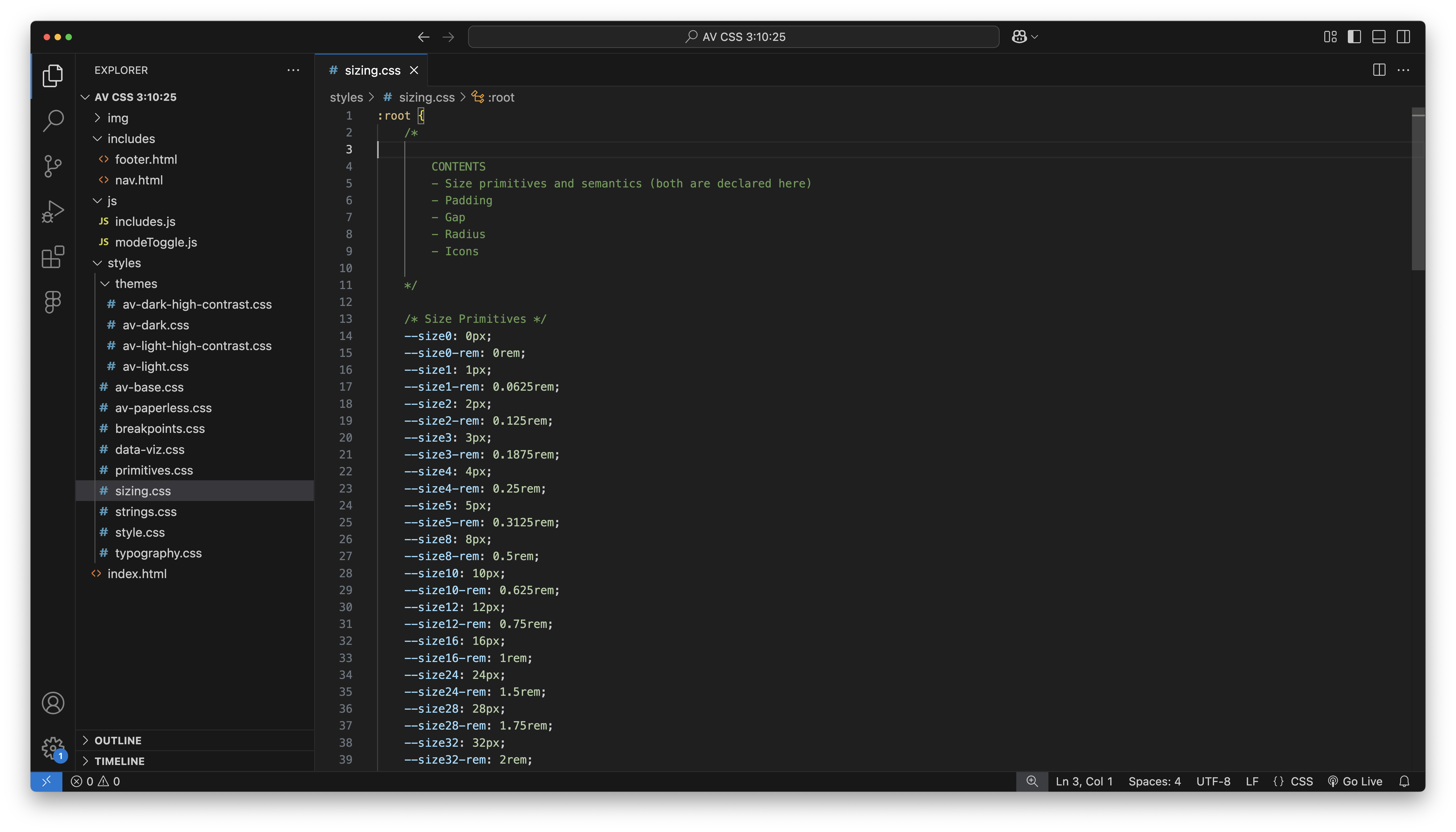
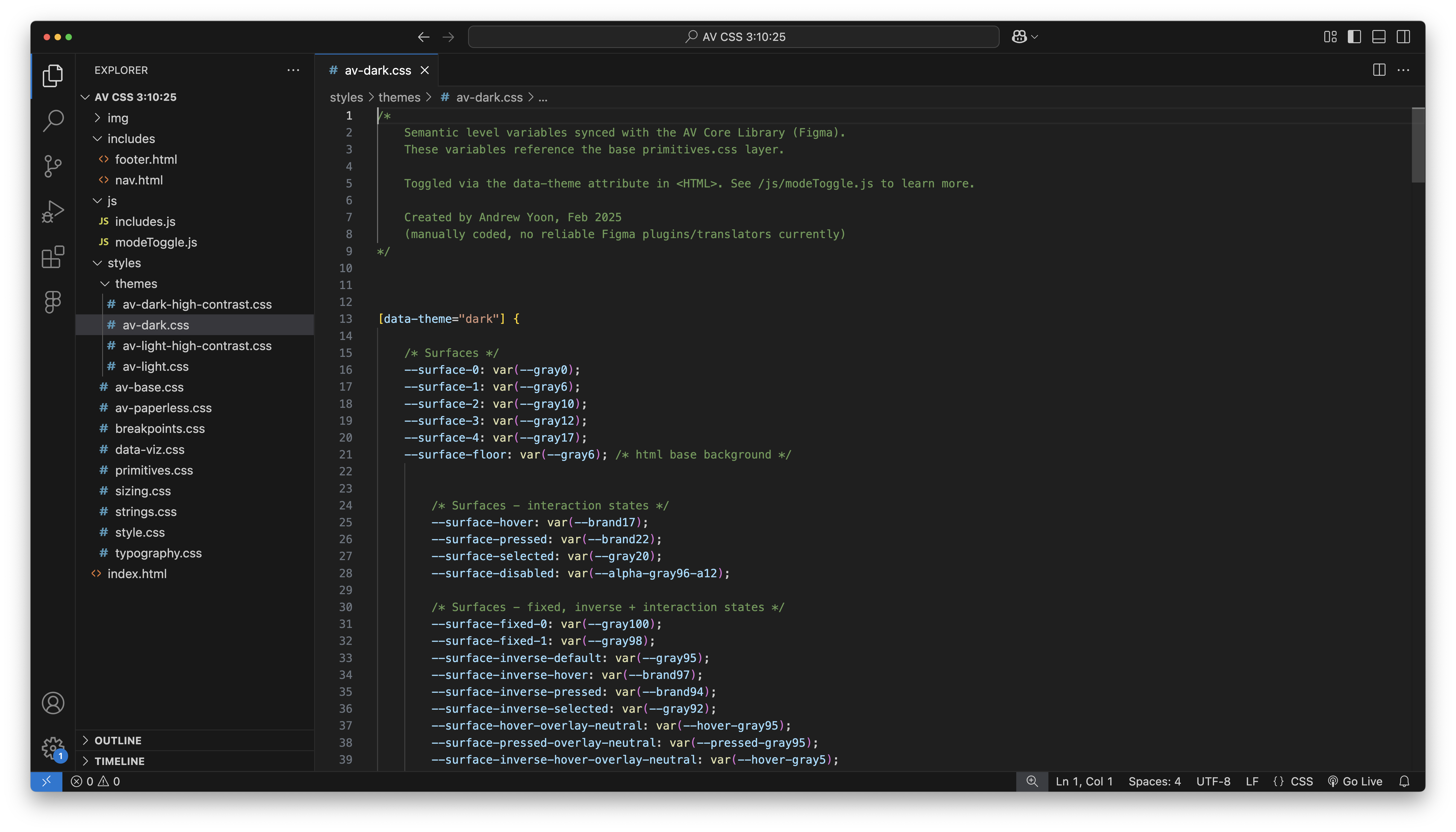
Through much experimentation and interation went into ensuring a scalable, compliant, harmonious base color system. AV's primities are based off HSL, rooted in mathmaetical steps, then refined with human eyes. Design systems builders know the true test of a ladder is how efficively the primitives handle dark mode (when piped through the semantic layer), which reminds me of the graphic design practice of flipping a composition upside down to see if it still holds up.
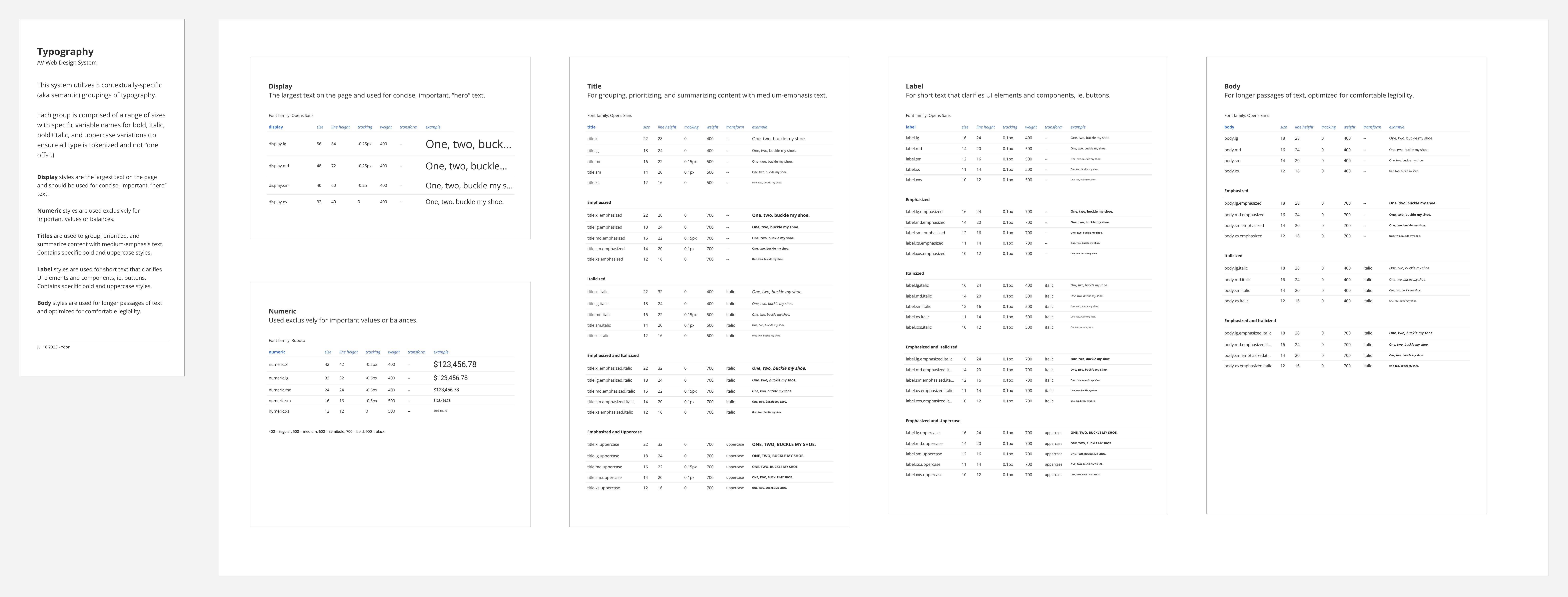
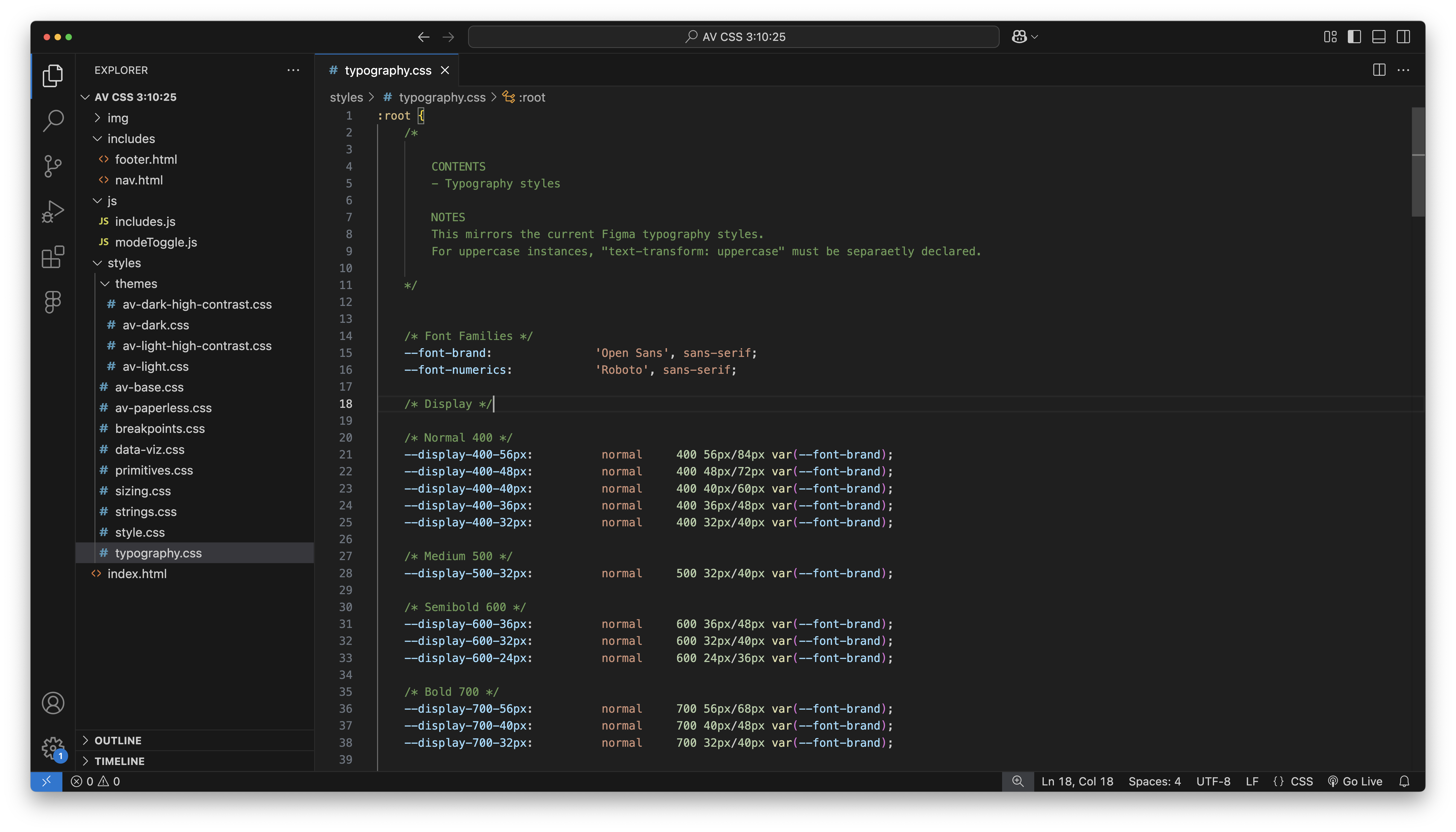
From the greater DS community, I've seen the least variance/experimentation around typography style systems. Figma's recently added variable support doesn't add a whole lot, and in some ways adds unncessary complexity. I think the nature of typography is more consistent and simple compared to the functional duties of color. It's aesthetic should almost be invisible, or at least passvively felt, so that the actual message of the words can be most easily communicated. Of course there are editorial/artistic excetions, but for the majority of utility focused apps, delight is most experienced through a clear, and effortless experience.

Some thoughts on hierarchy and light/dark modes. I've become more certain that our natural perception of light/shadow is how we should approach light and dark mode. Imagine a website as a 3d printed city, with different sections of the website standing at different heights, a modal floating high, the footer slightly recessed into the earth. Now imagine a single light source up above, ie. the sun or the moon. The visual priority of which things are lit in the foreground vs background remain the same, becoming overall brighter or dimmer depending on whether it's day or night.
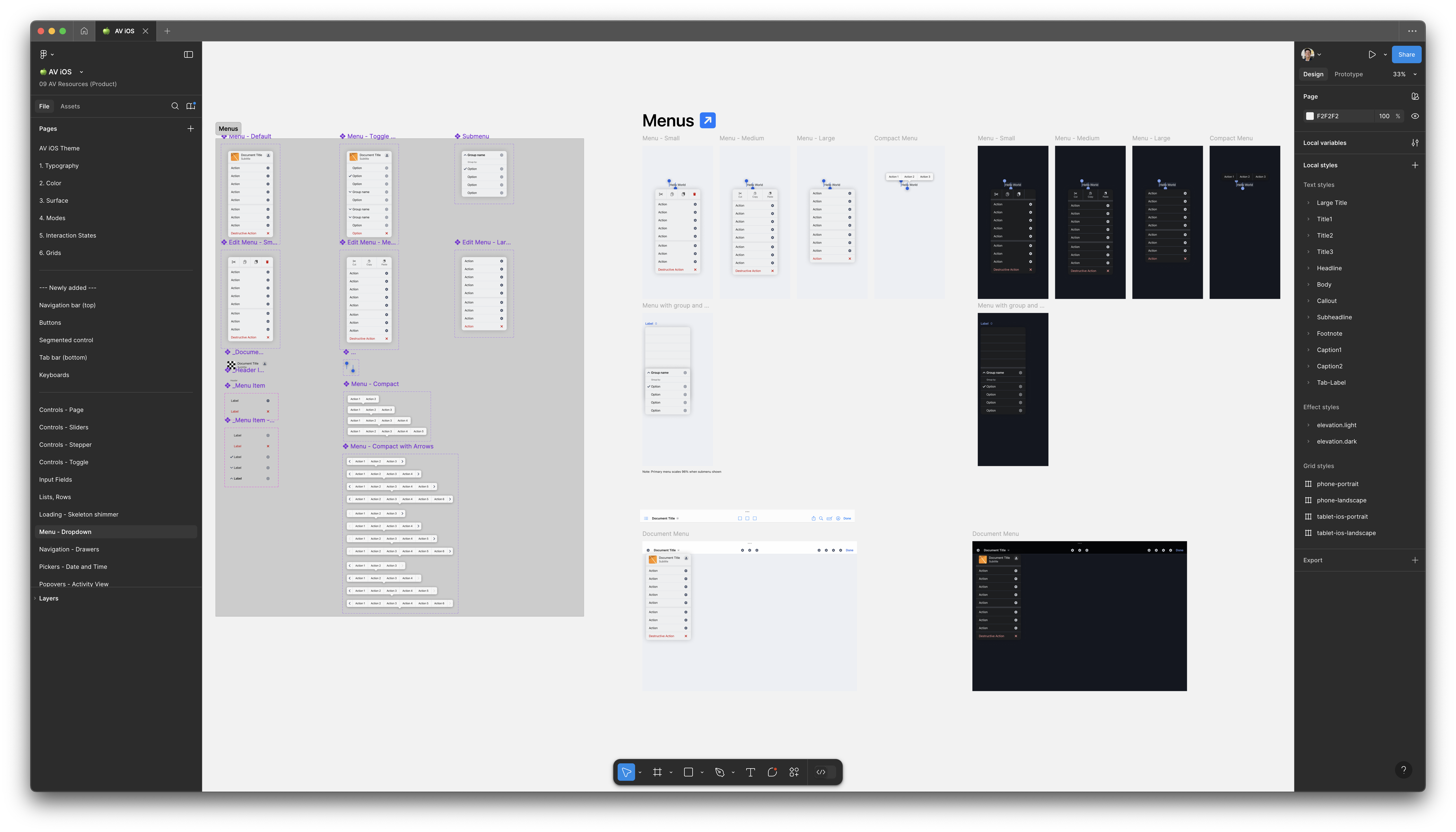
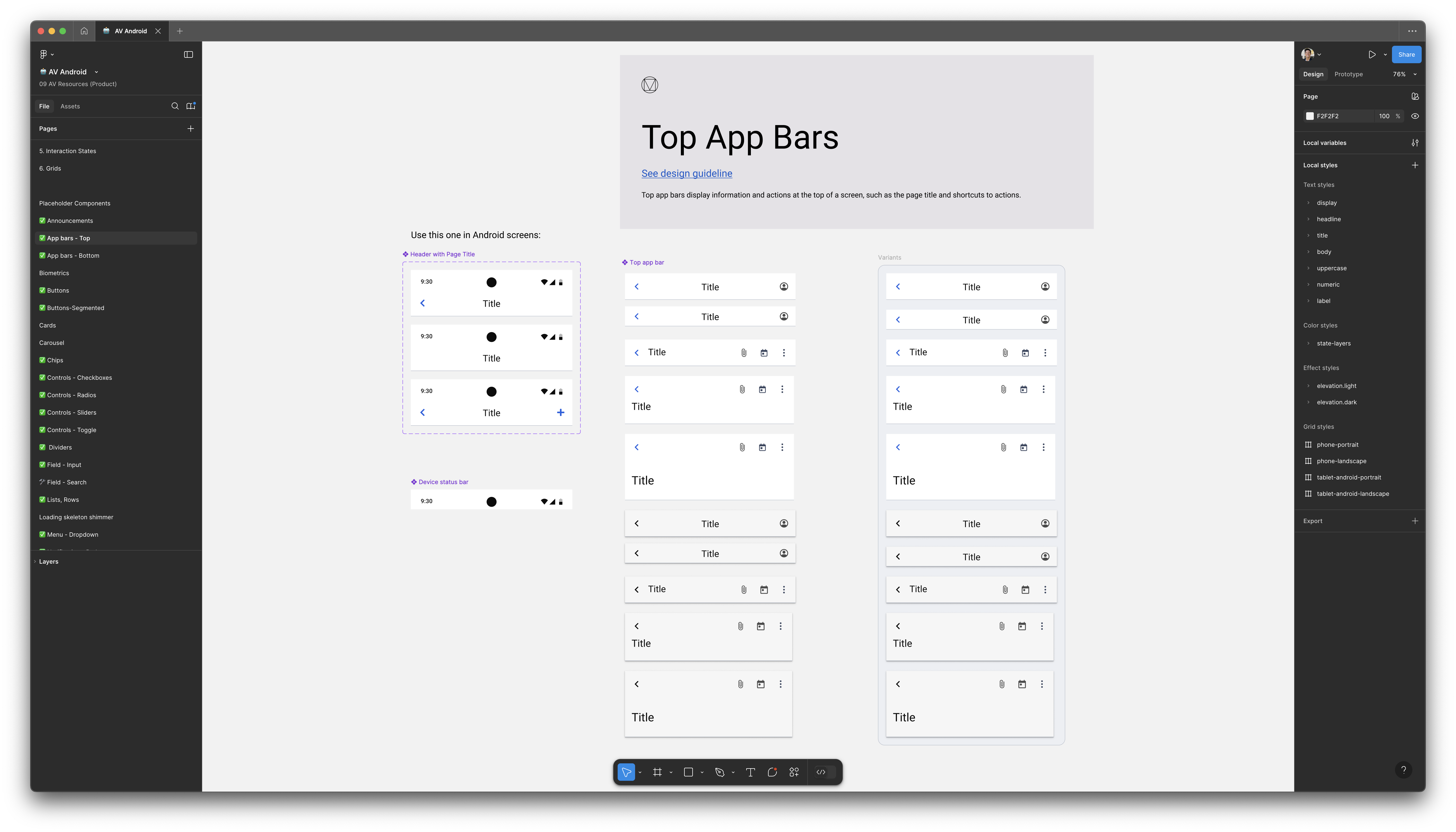
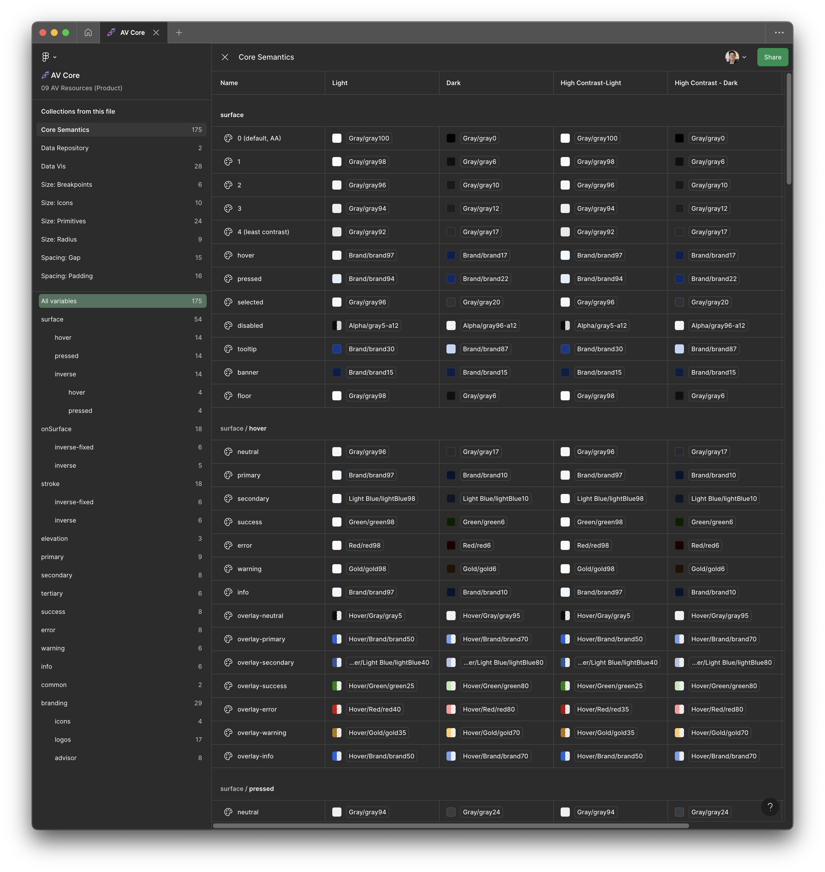
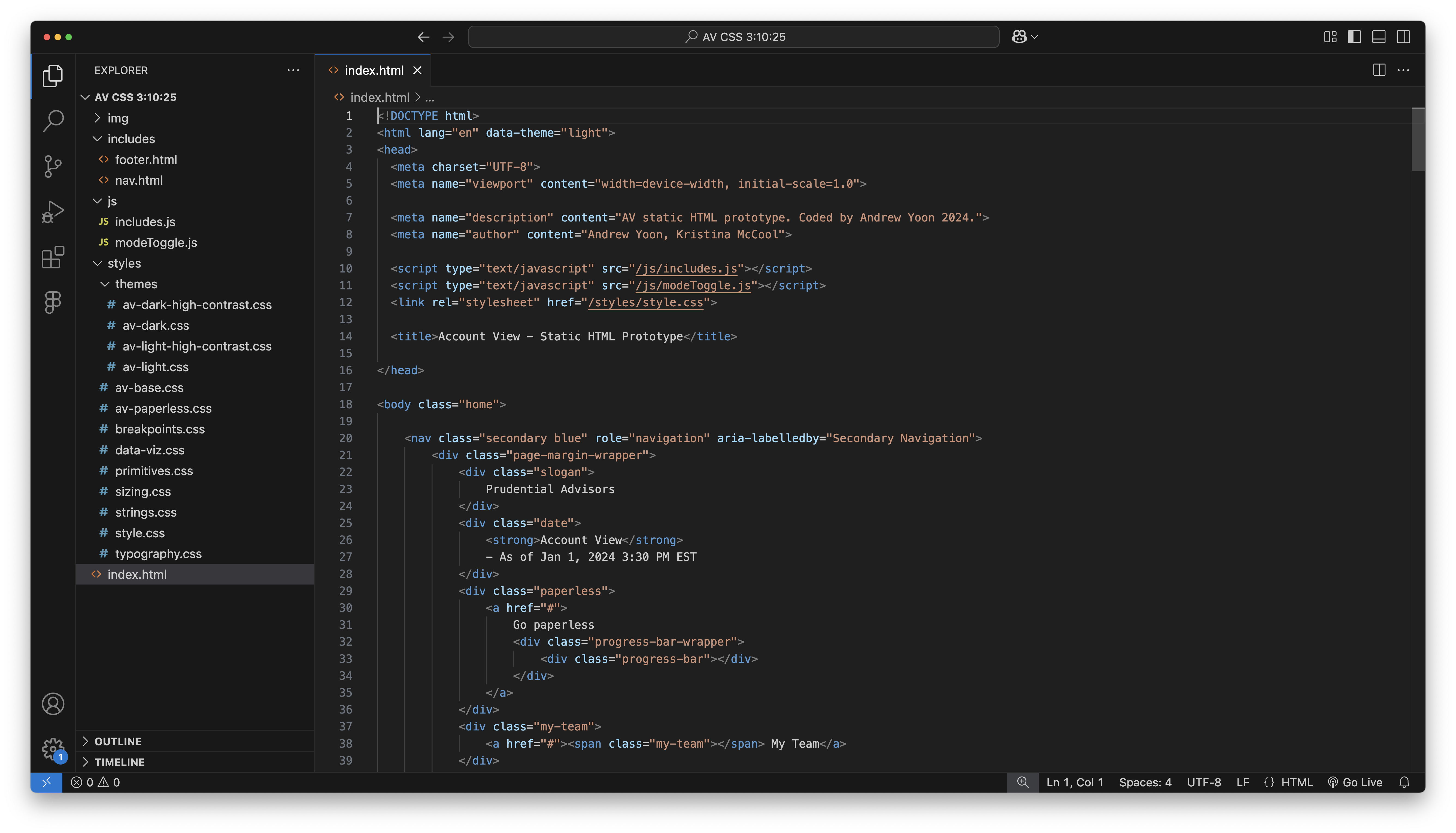
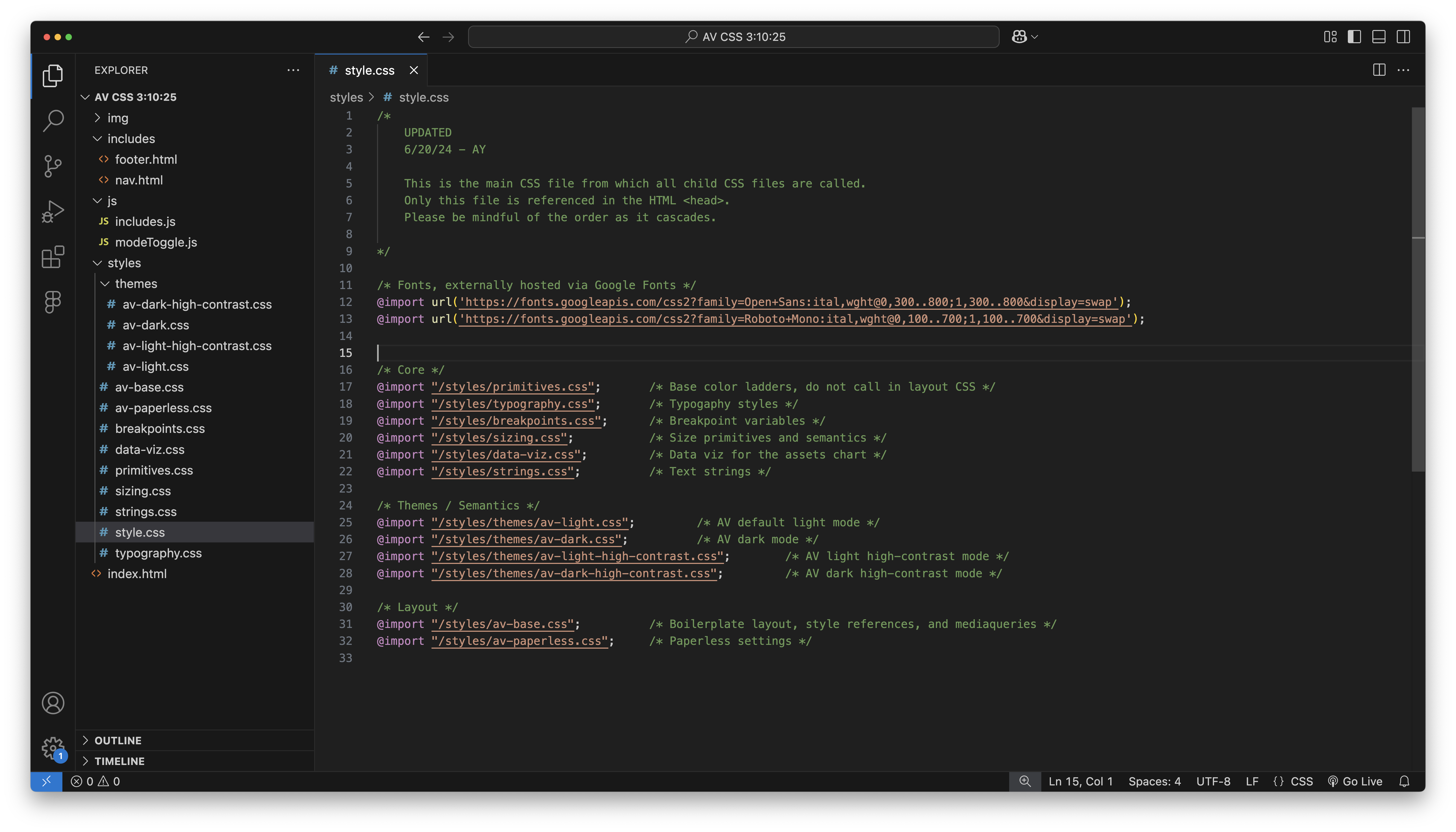
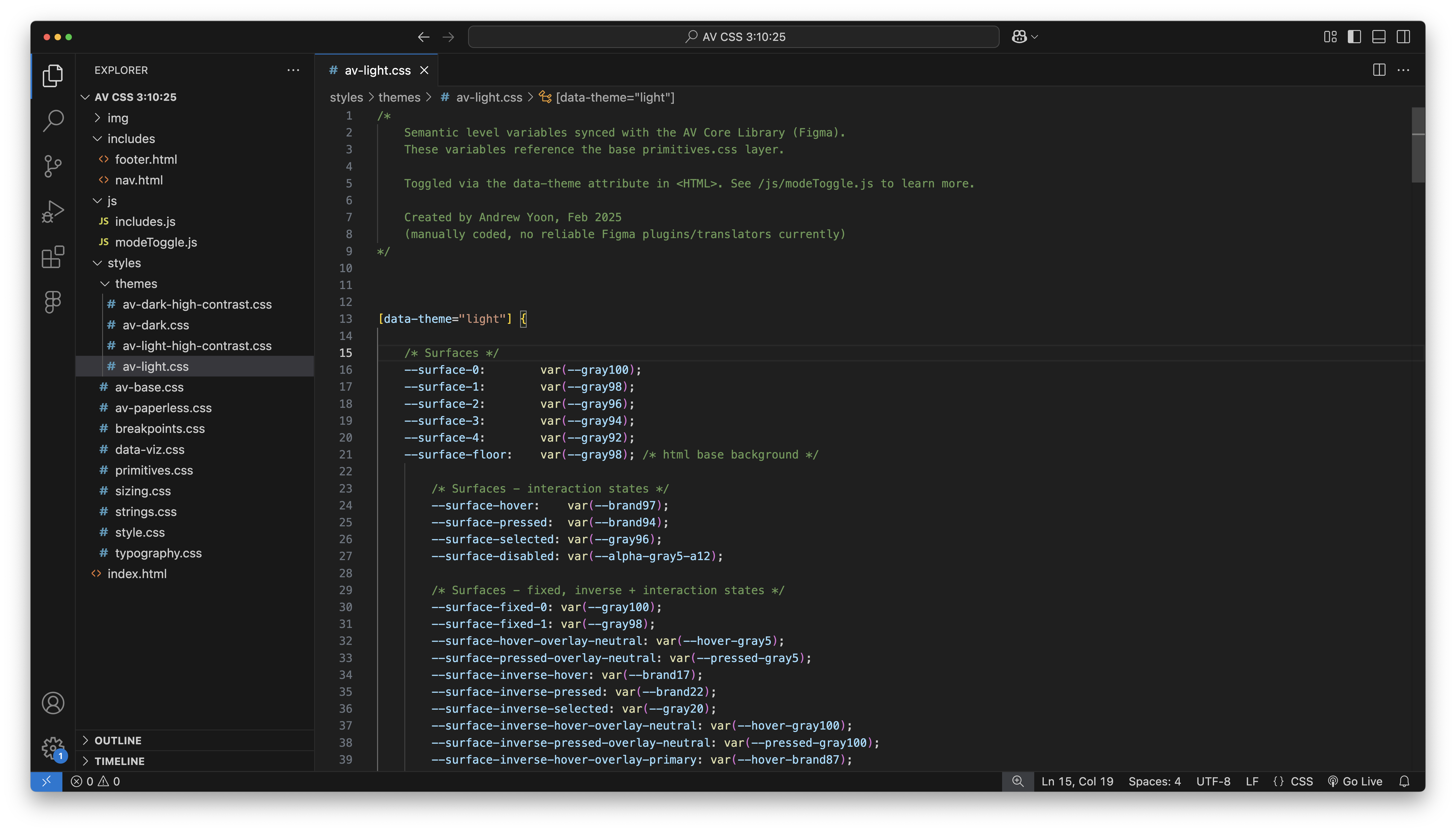
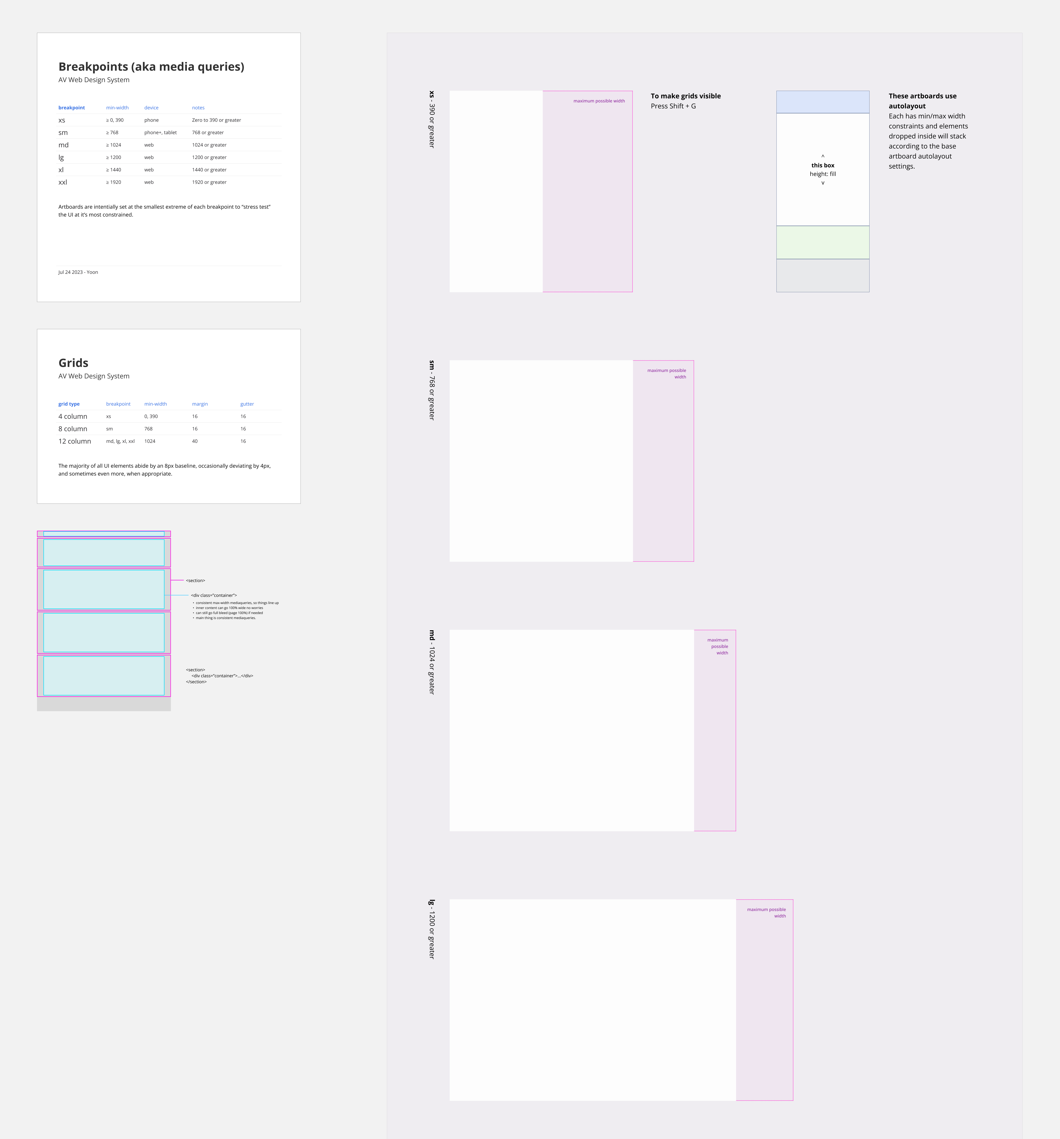
AccountView follows naming standards adopted by Figma/Google/Atlassian and other industry thought leaders. Much can be said about how to name these variables and how to organize their structure. But in short, they need to be maximally efficient to understand and scale, with their heiharchy and organizing logic built into their name. For what I call "semantic pairings", AV uses the "on" prefix, popularized by Google/Figma (not sure who did it first). So if you're using a certain type of surface, you know it's corresponding "on-surface..." goes with it. The ensures its intended usage and accessibility compliance.
It's my believe that a system that aims to be too ridid or lean is ultimately self-defeating to the overall goals of a design system. Any product will have its own idiosyncratic nuances, for which I employ "super semantics". These are essentially specific, custom variables that cater to product specific styles, where the base semantic system can't quite nail.
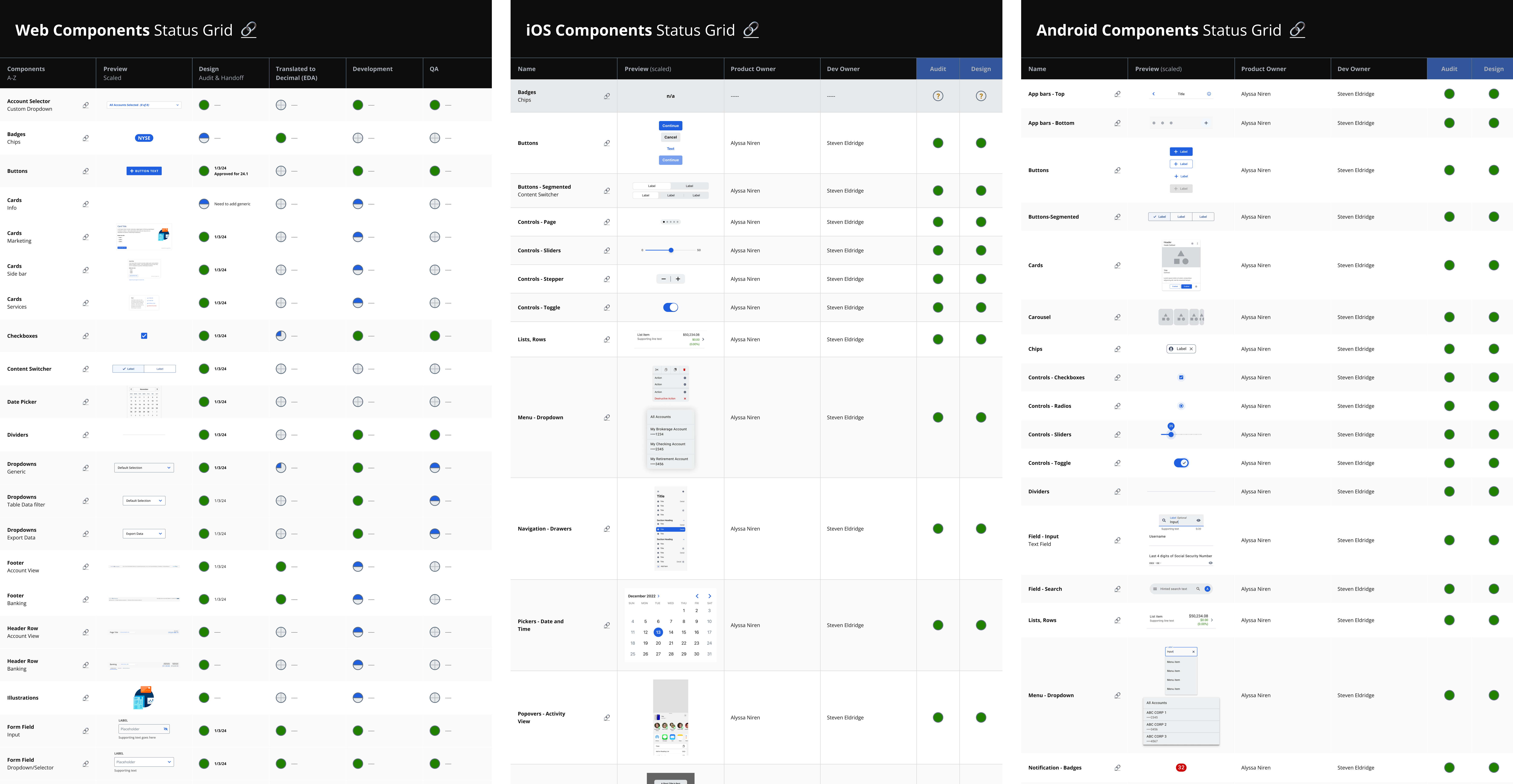
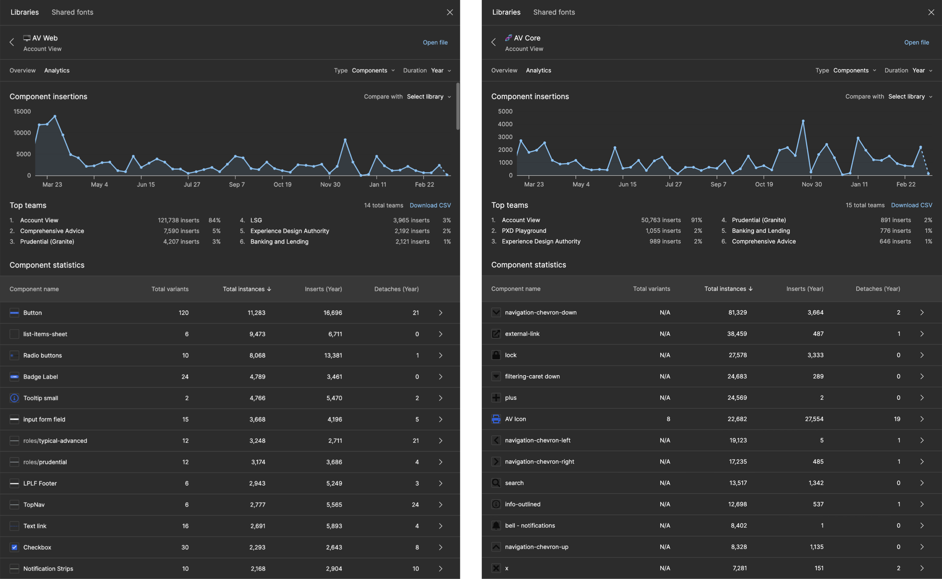
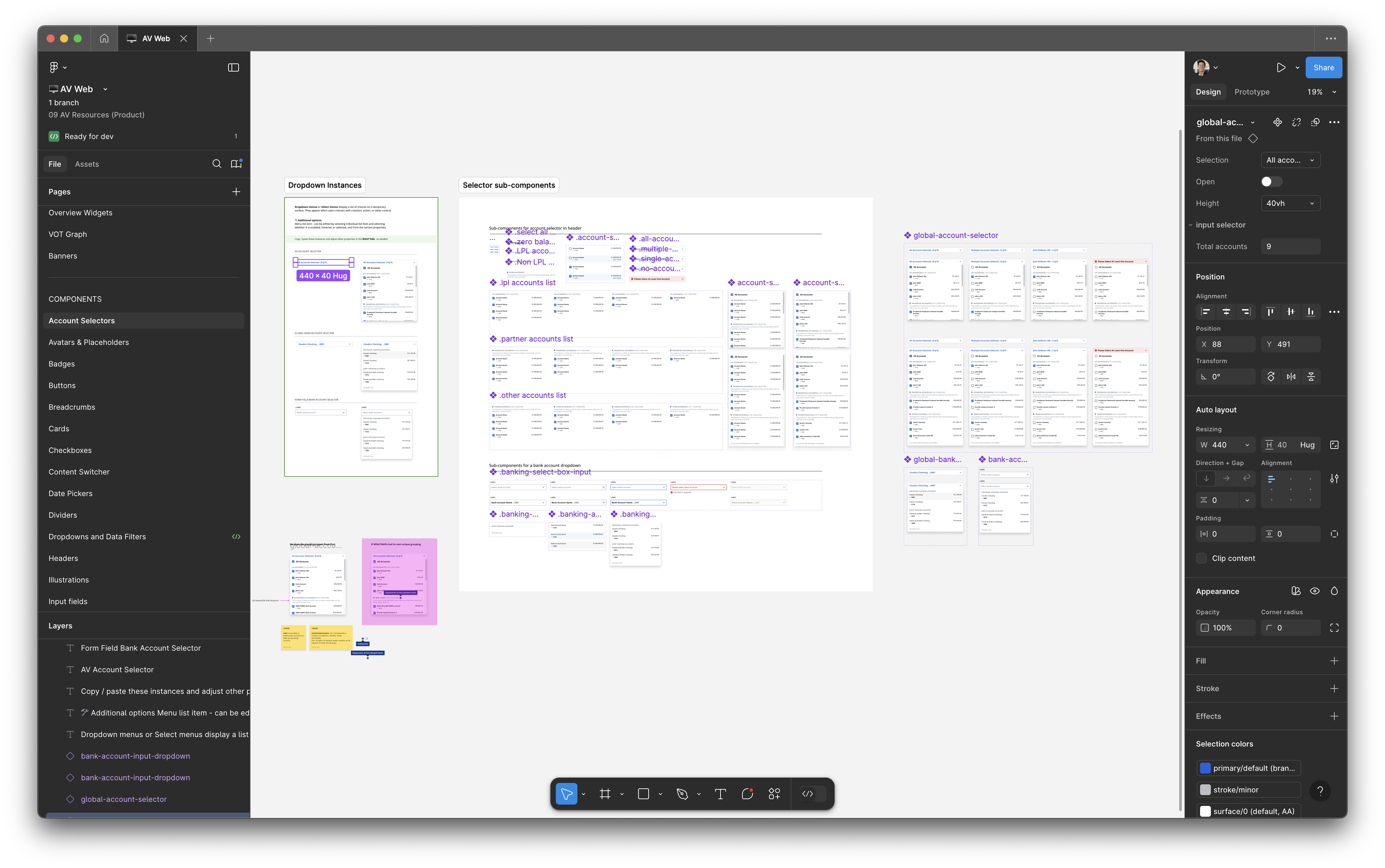
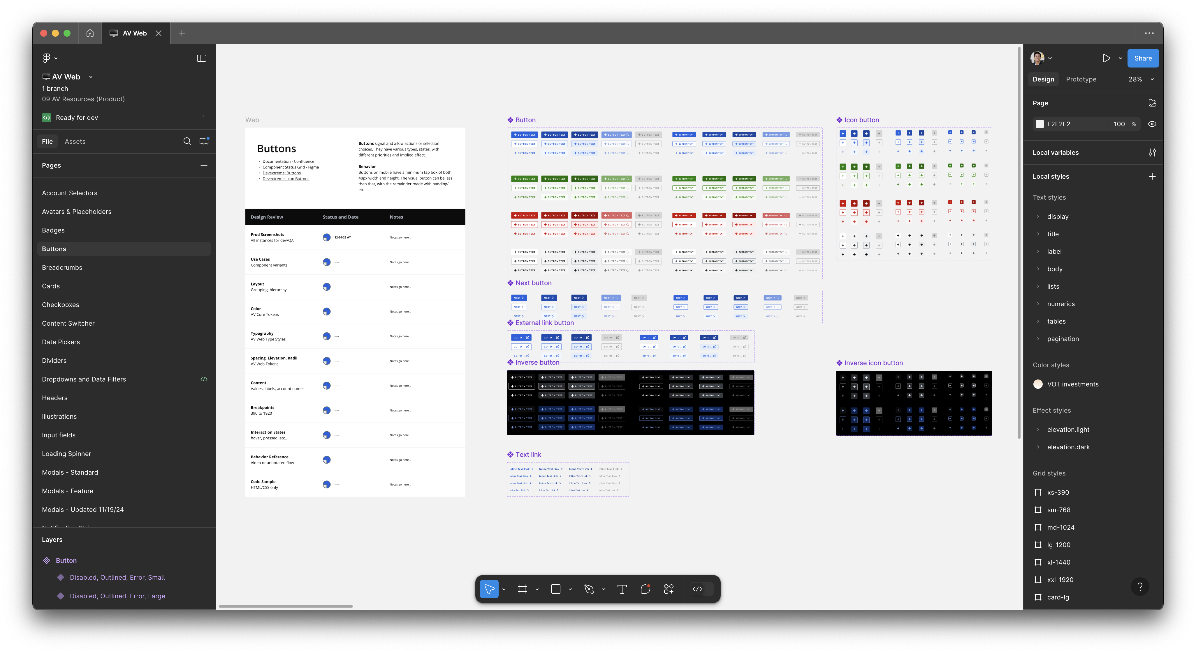
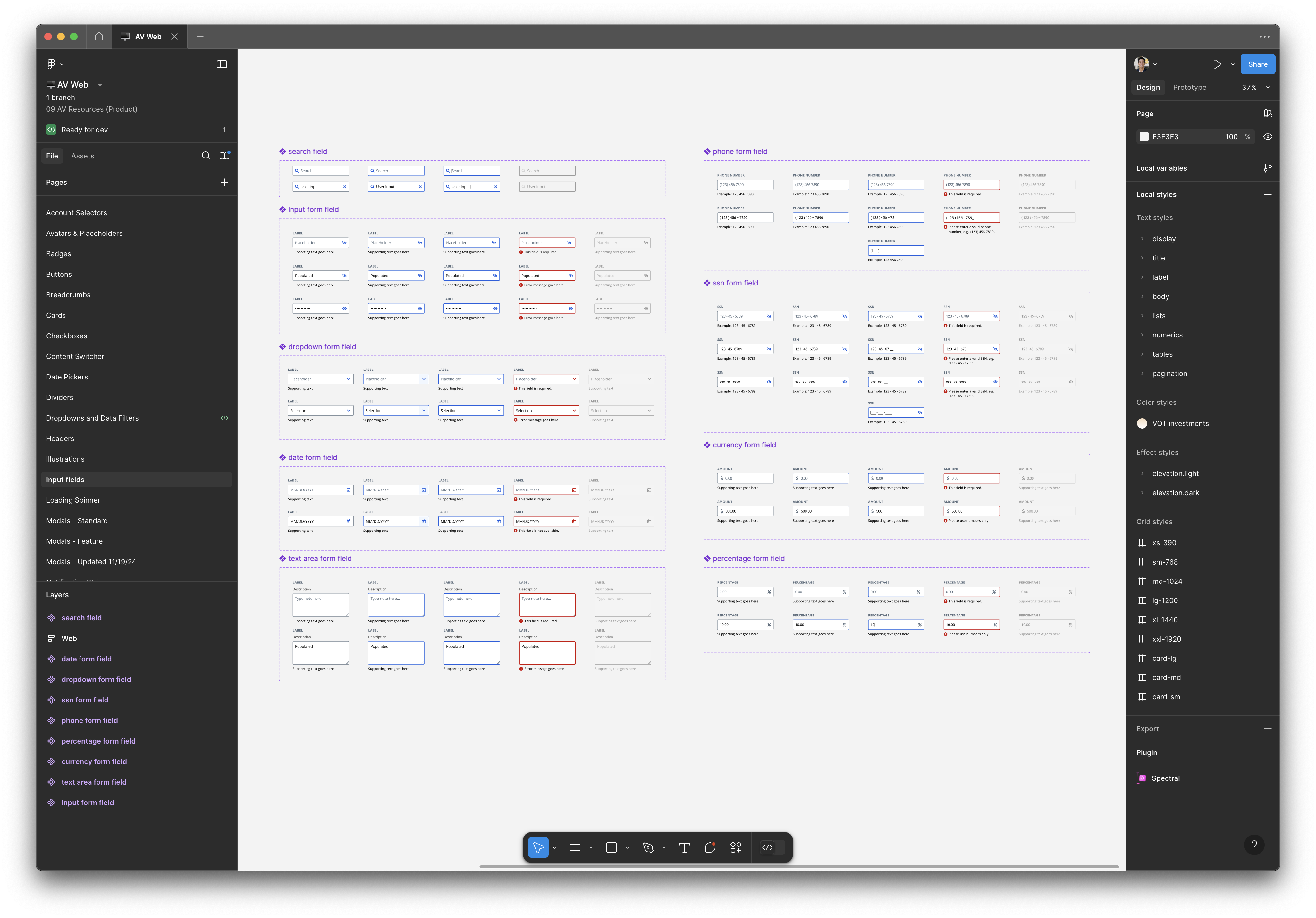
AccountView's design system spans 4 platforms, 6 Figma libraries, totalling 1,016 variables, 409 styles, and 763 components.